Monday, November 13, 2023
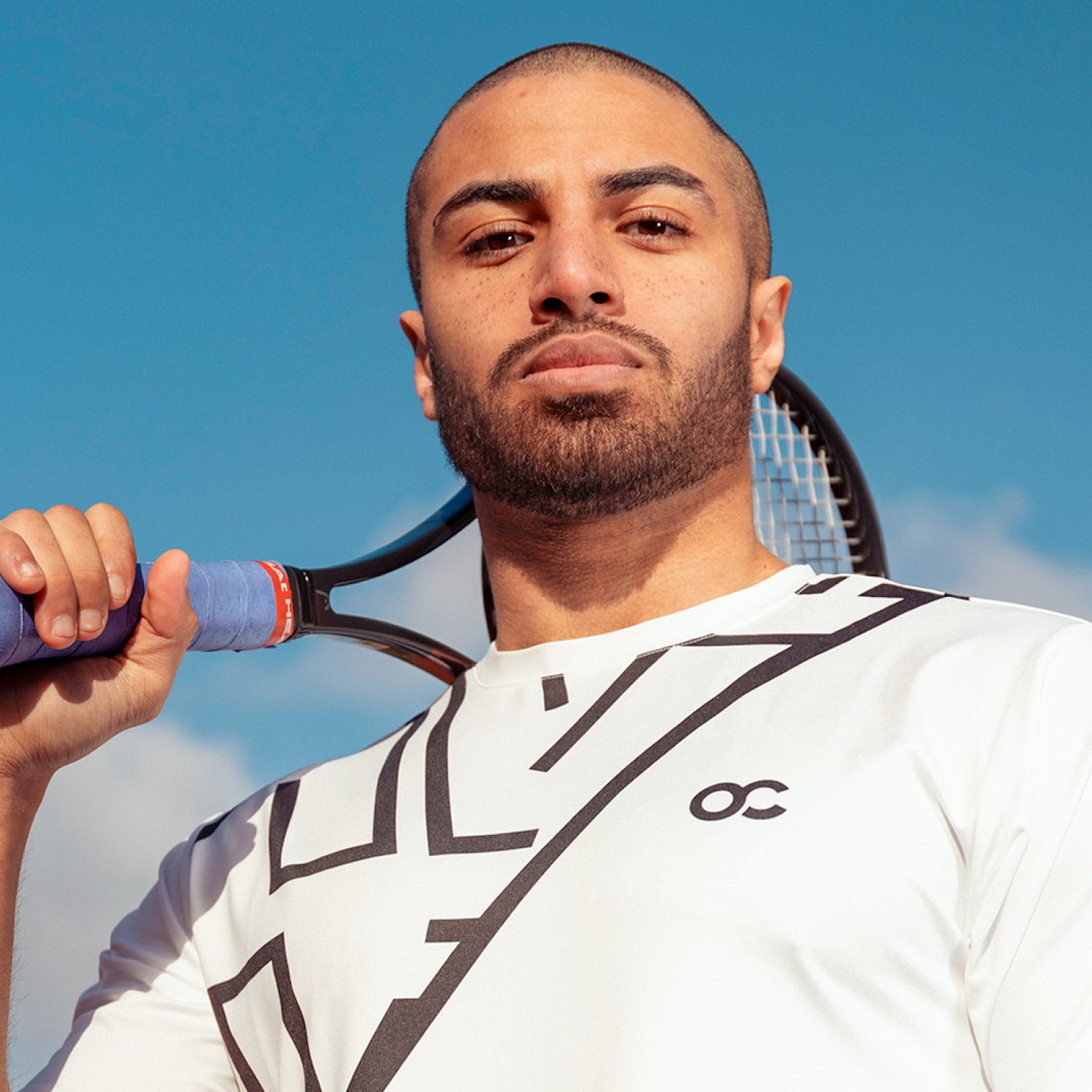
Oncourt already had a logo but lacked a clear visual identity to support its growth. The challenge was not to reinvent the brand but to build a recognizable and confident visual system around its existing core. I shifted the focus to the elements that shape the overall feel of the brand: color, tone, consistency and application across all touchpoints.
I developed a renewed identity that translates into a clear visual direction for both product and lifestyle content. The color choices were informed by the surfaces on which the sport is played referencing iconic tournaments such as Roland Garros. I led the art direction for the content shoots and curated the photographers to ensure the imagery aligned with the character of the brand.
The result is a more grounded and credible brand that feels confident without losing its original identity. By establishing a rigorous grid and a cohesive typographic language I ensured that Oncourt can scale its presence across digital and physical environments with ease.
Category:
Rebranding
Client:
Oncourt
Duration:
2 weeks
Location:
Amsterdam, Netherlands