Friday, April 12, 2024
Design is only as strong as the system behind it. For FUCO, the challenge was to build a brand from scratch that could disrupt the crowded craft coffee market with a bold, joyful character.
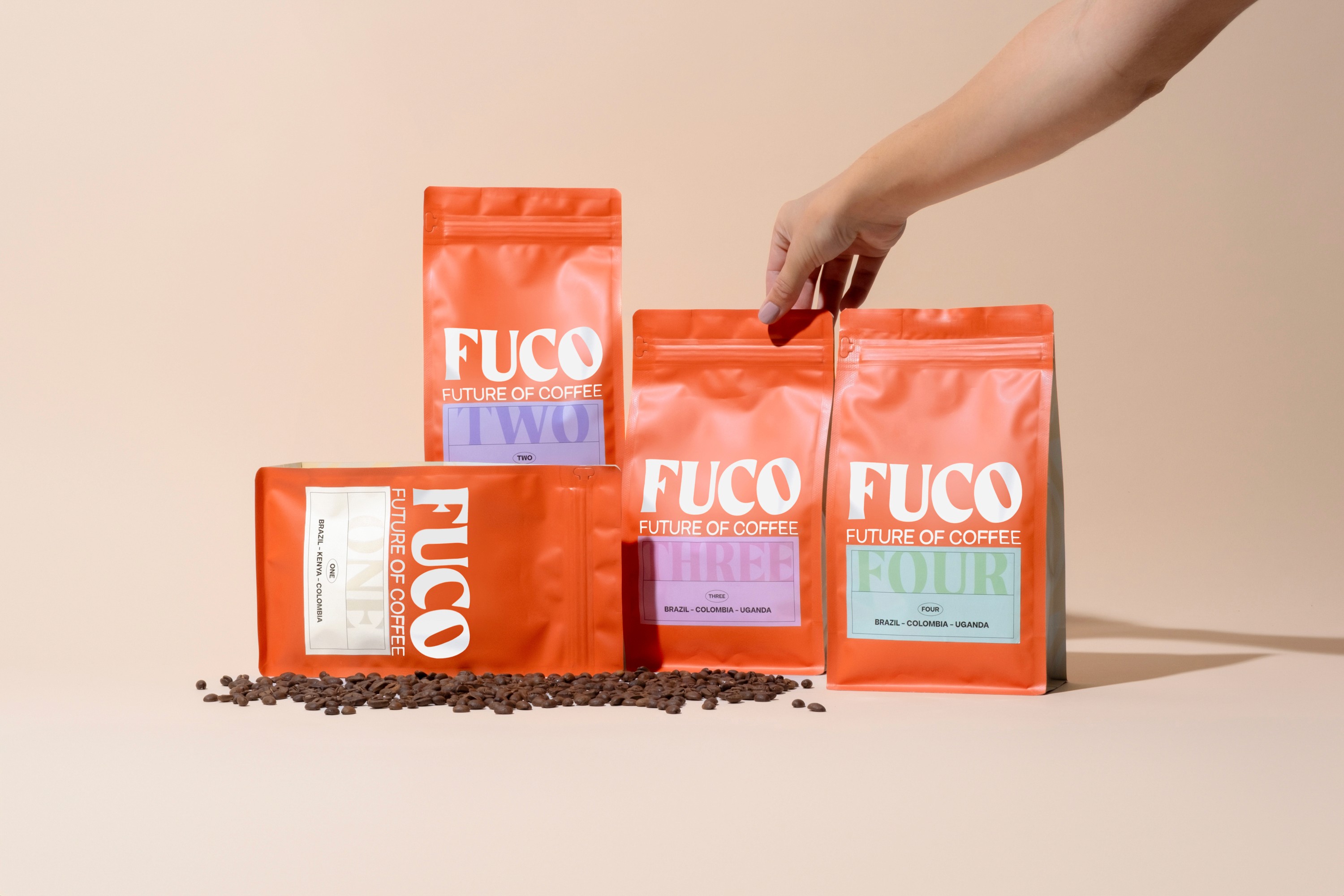
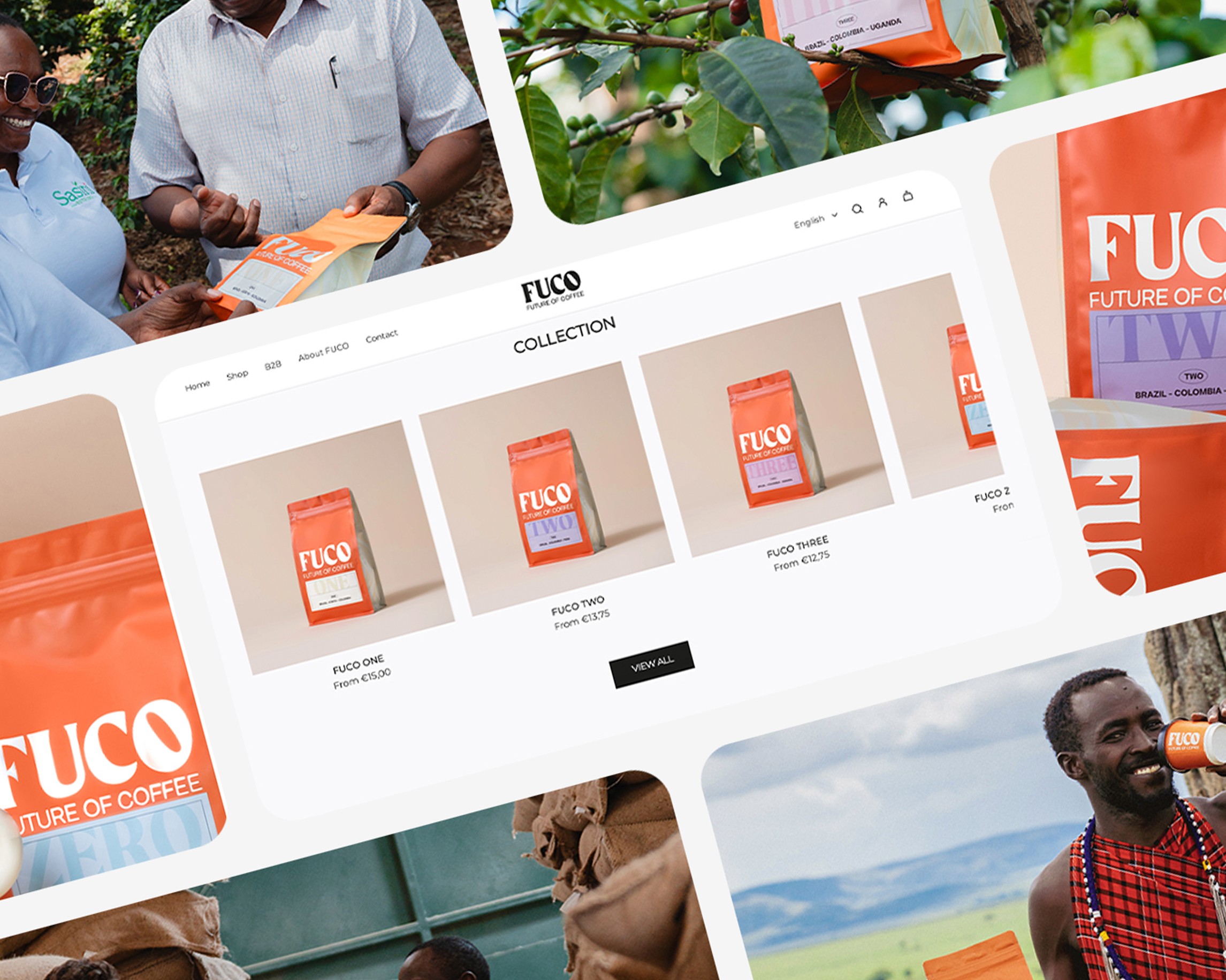
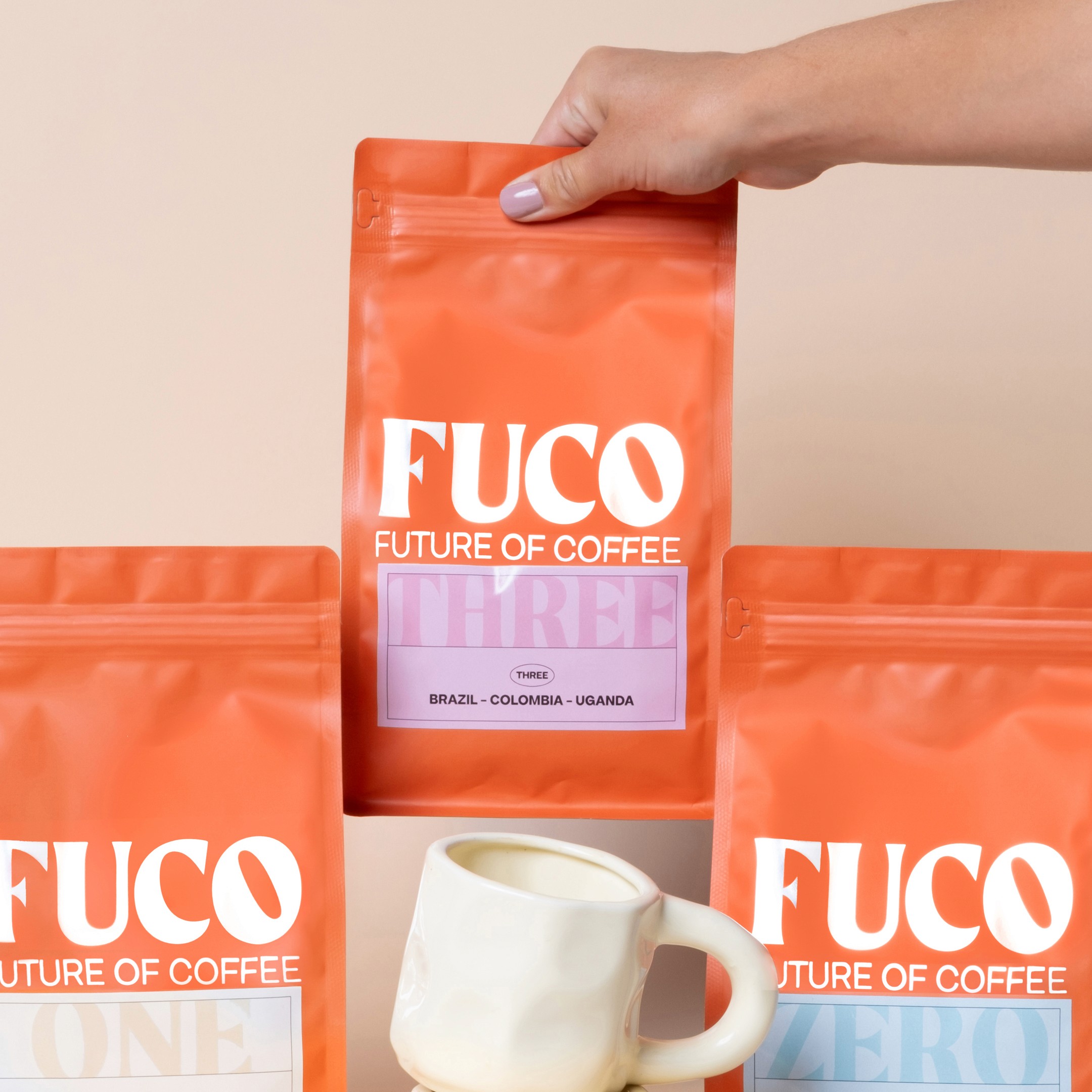
I designed a modular packaging architecture rooted in efficiency. By using a single, high-quality base bag, we built instant brand recognition while keeping production costs optimized for a startup environment. The visual language is led by fluid, 'liquid' shapes balanced with a daring color palette that pushes the brand far beyond the traditional coffee aesthetic. Even the smallest details, like the bean integrated into the 'O', serve as subtle 'easter eggs' that reinforce the brand’s identity.
From the typographic grid to the art direction, every decision was made to ensure scale and consistency. The result is a future-proof brand that balances functional efficiency with an expressive, high-impact aesthetic that resonates with both retailers and consumers.
Client quote
"The brand identity is powerful and fits our vision perfectly. We are frequently complimented on the striking branding and packaging. We went outside our comfort zone with the bold use of color: brighter and more outspoken, yet still stylish and true to who we are." — Annette Douqué, Founder of FUCO
Category:
Branding
Client:
FUCO
Duration:
6 weeks
Location:
Amsterdam