Monday, November 6, 2023
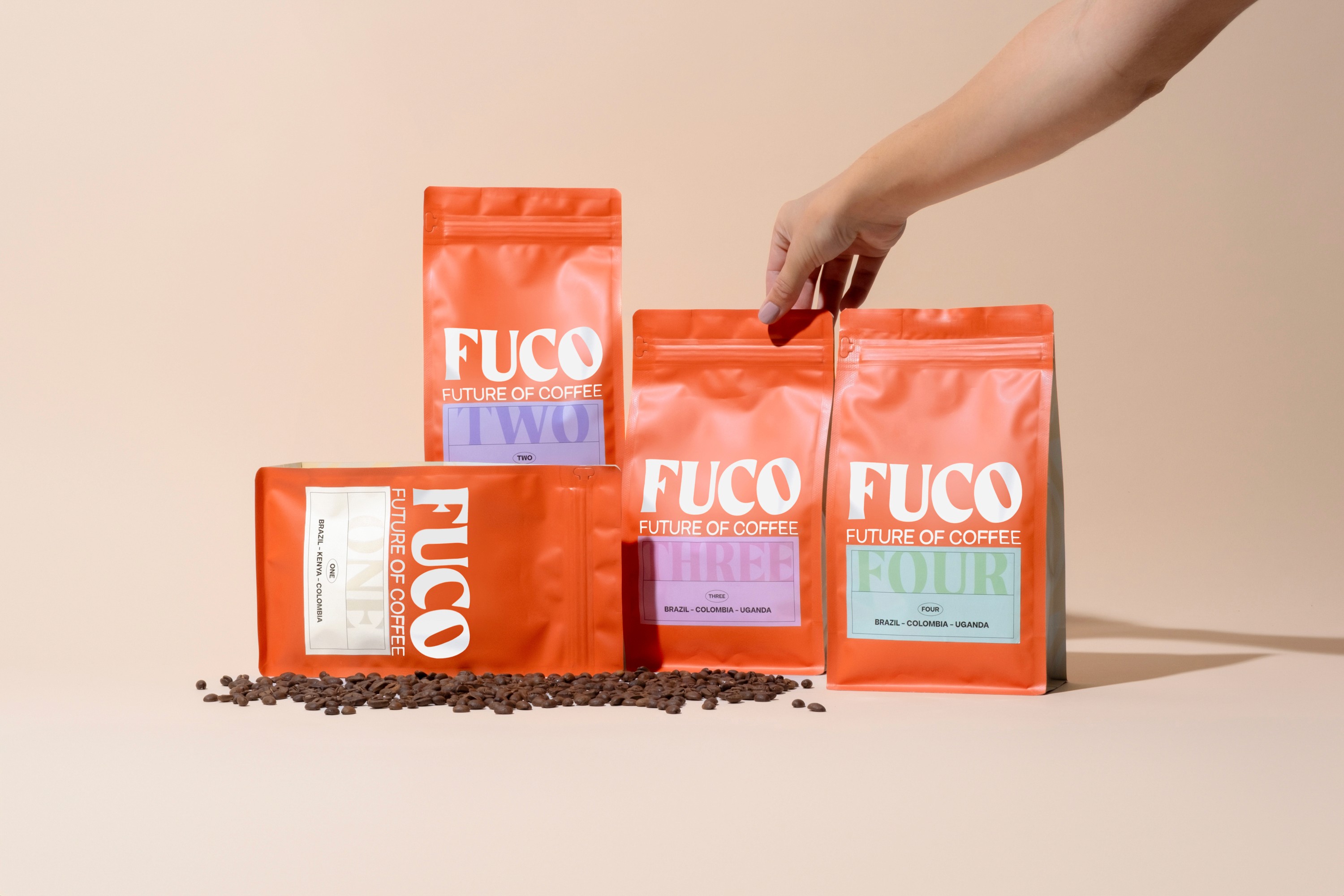
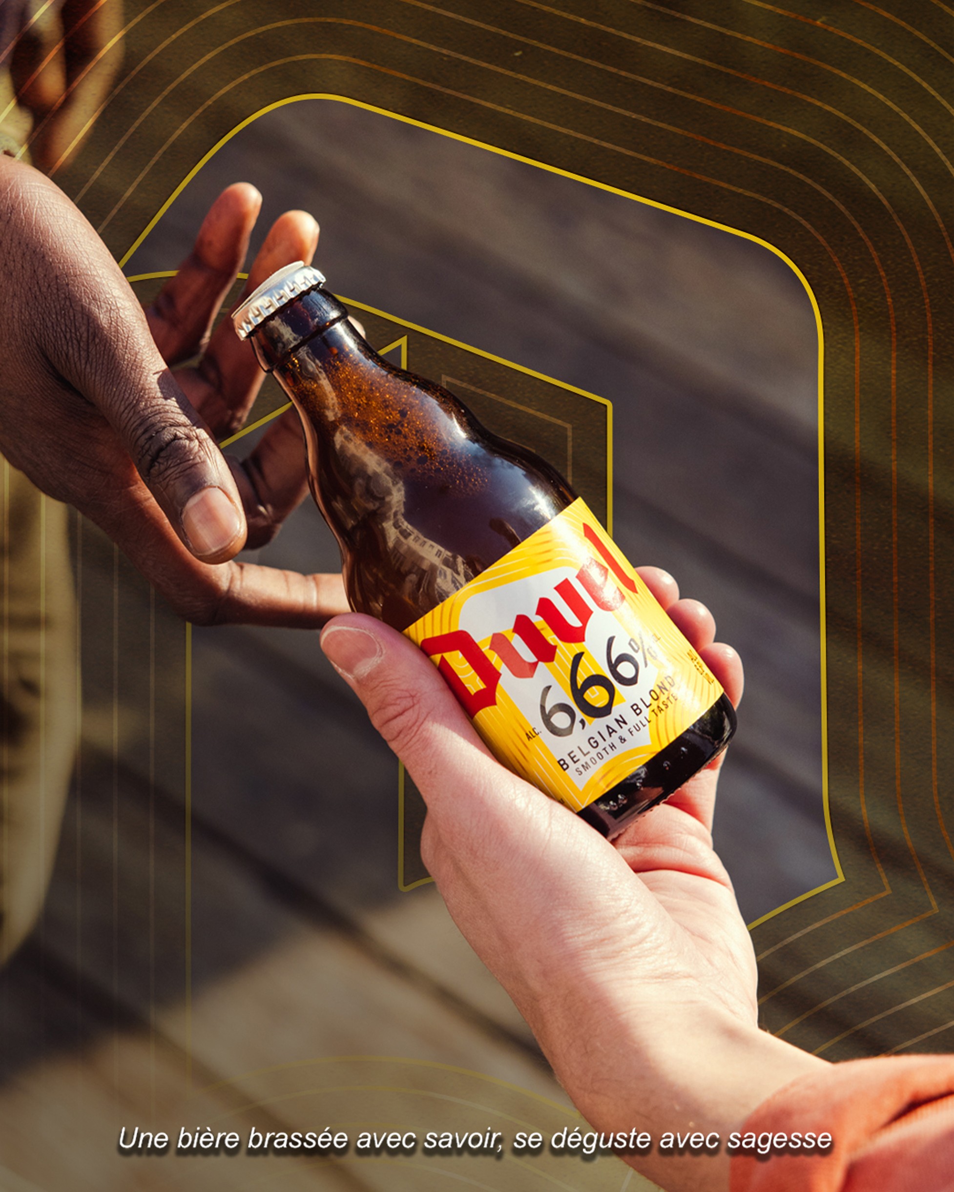
Eager was created to bring strategic clarity to a growing collective of specialized labels. The challenge was to design a brand architecture that functions as a strong entry point for clients while allowing each sub-label to maintain its unique character.
I developed a visual system built around a core set of building blocks. These elements form a recurring pattern that symbolizes the connection between the different departments. By intentionally limiting the number of design assets, I pushed the brand to remain creative and adaptive. The pattern itself stands for agility, reflecting how Eager moves alongside an evolving market.
To ensure consistency across the ecosystem without becoming visually interchangeable, I made deliberate choices in typography and color palettes for each label. While their identities differ, similar structural elements like a shared footer design and "Part of Eager" references create a sense of belonging. The goal was to spark curiosity, making the audience feel a sense of familiarity across labels while respecting their individual expertise.
The Labels
Category:
Branding
Client:
Eager
Location:
Amsterdam