Monday, August 5, 2024
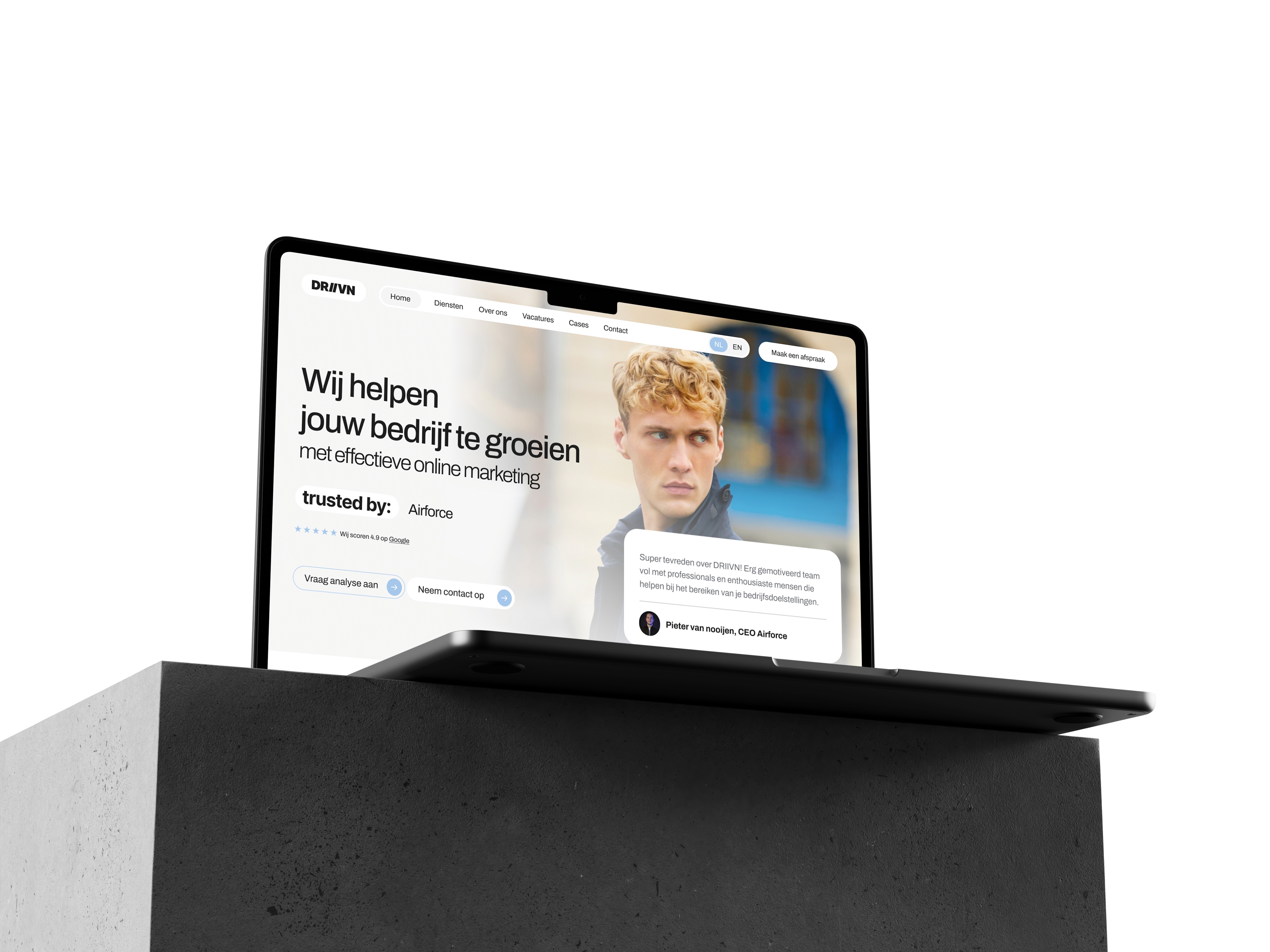
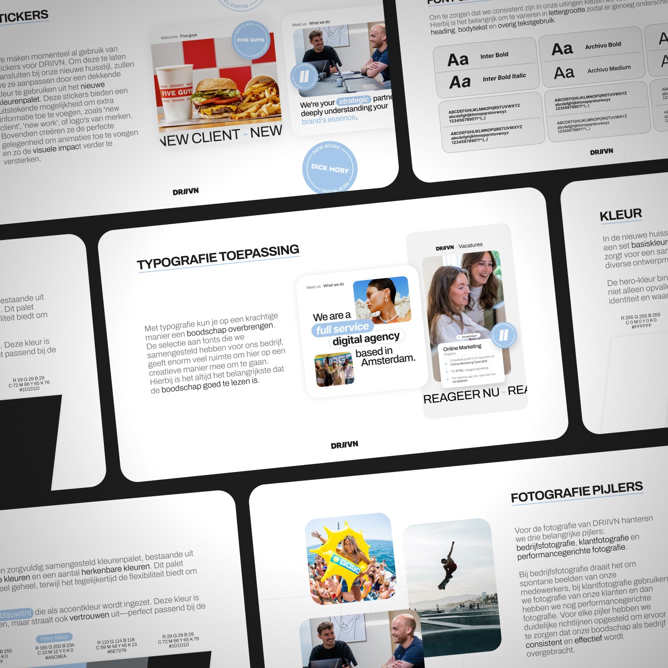
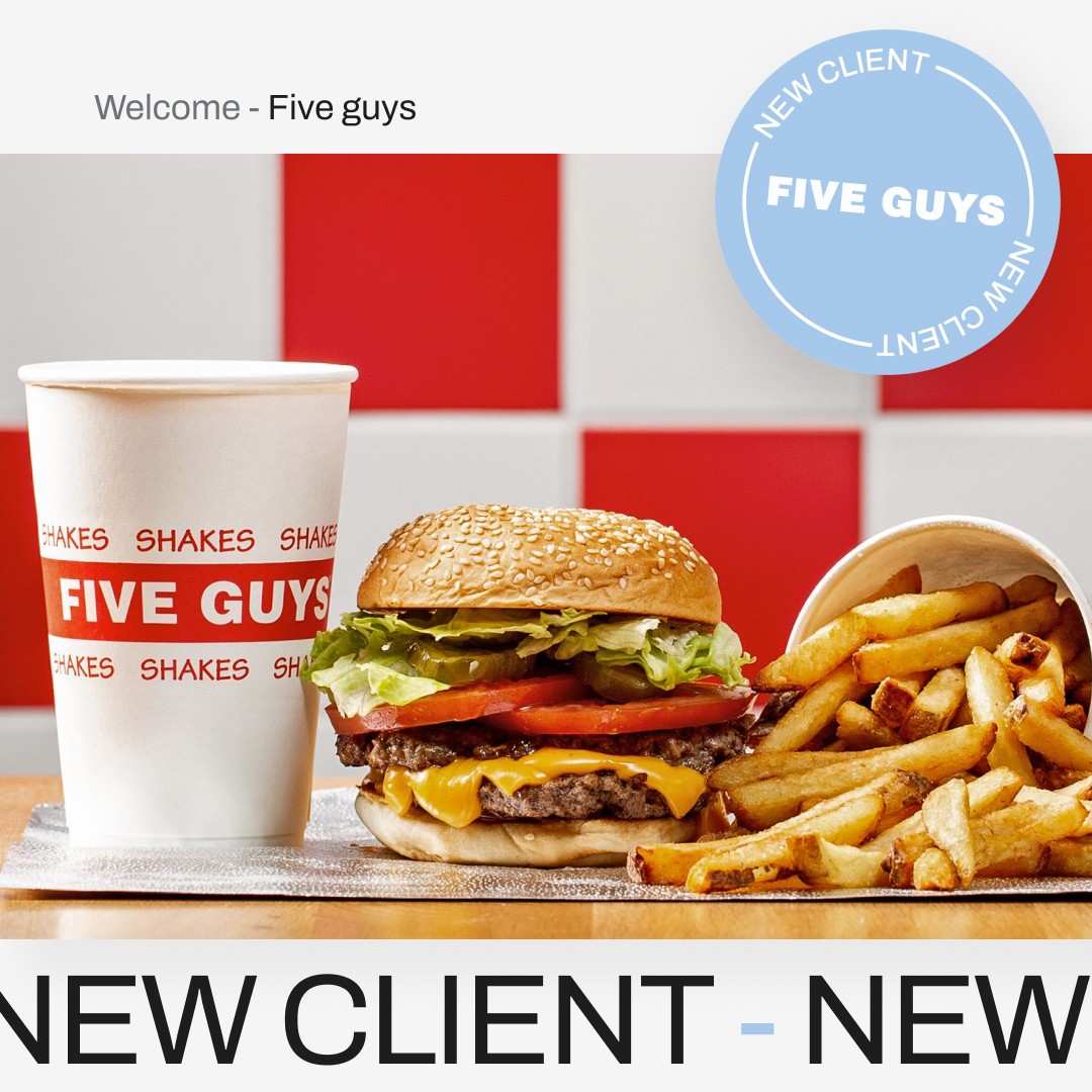
For DRIIVN the existing logo was retained but the visual world around it was fundamentally reworked. The previous identity relied too heavily on a literal sports mentality which no longer reflected the broad professional services of the company.
I implemented a strategic color shift towards a pastel blue palette to evoke a sense of reliability and trust. By focusing on clean typography and a structured grid system I transformed the brand from a sports focused label into a future proof professional partner. This refinement proves that you can change the entire perception of a brand while keeping its original mark intact.
Category:
Rebranding
Client:
DRIIVN
Duration:
2 weeks
Location:
Amsterdam